Try to imagine a website with a poor landing page – Unclear CTAs, No mention of incentives, Dumb headlines, Too many words, and slothful loading speed. Would you care to even look further or simply abandon the website?
First impressions are the real deal. Not only to provide a positive outlook but will also drive value in the long term. Especially in the content marketing industry, landing pages could well be your last true chance to fish potential customers.
We’ve been critiquing the grassroots, and it’s fair to say that some marketers can’t evade committing deadly sins while creating a landing page. And all in the name of limited time and resources? What a shame!
So, we wanted to make the most of this blog post to explore the scratchy patterns in landing pages and help you avoid these mistakes. Hopefully, by the end of this post, all your queries will be answered. So let’s just dive in.
7 Deadly Landing Page Sins You Don’t Wanna Commit!
Landing pages are one of the many things that can make or break your marketing campaign. It is important to have a well-planned landing page, but it is equally important to adhere to the right design elements and ensure that your landing page design doesn’t cross the 7 Sins of Landing Page Design and fall flat on its face.
1. Too Many Offers
Take a second and put yourself in a scenario where you are trying to book a motel. You type it into the search bar, click the first listing that shows up. And it’s a disaster. Offers, Information, and whatnot are all over the place. There are links for motels info, deals, popular destinations, different lines, and specialty corners dancing across the page.

Also, there’s a quote request which you got tempted to fill out in the beginning. All of this got you confused and overpowered. And 2 seconds later, you abandoned the search and go over to the next brand, which has a lot nicer appeal.
Offers and promotions have a repelling effect on visitors. But there’s a solution.
Steps to Fix:
– Use short Sentences
– Place customer testimonials at the bottom of the page
– If possible, try including videos or a quick GIF to make it easy for the visitor to understand what offers they really have at hand.
2. It’s Not Always About You
Isn’t it fair to talk a little about yourself while selling products like the features, customer base, budget, team, and camaraderie you guys share? Well, it is, but only when you’re trying to send your prospects up and running from your landing page. Yes, I understand your company is the one in question, but that doesn’t mean you’ll start boasting about your product’s features.
What are they going to get after buying your product? More leads, Skyrocketing conversions, or a thousand customer cold pitches? Remember, you have to engage the prospect in a dialogue. Put them first, and your campaign will start to pace up.
Steps to Fix:
– Stop the CV Language – Talk directly to your customer and start a dialogue. Use ‘you’ and
‘Your’ and leave out the We’s and the Our’s.
– Translate features into value proposition – Yes, you have so many items. You just took y days to do x,y, and z. But why should they care about all of that? Try to translate ‘descriptions’ into benefits that will improve their lives.
– Highlight the outcome properly – You don’t want them guessing on a landing page. Use numbers and stats quotes to show what impact you can have on your customers.
3. Targeting The Whole Crowd
Suppose you sell soaps and dishwashers. How should your landing page address the customers – The whole population or female working professionals, who have to get their household chores done quickly? You go throwing darts in the dark, you end up hitting everywhere but the target. Never make this mistake.

Steps to Fix:
Always try to narrow down on your audience. Conduct audience surveys, polls, AMAs on social media to figure out your ideal customer, their likes and dislikes, when are they most active and so on. Try to engage in a conversation and be honest about your product. The true audience will eventually stick in, and you’ll be ready to scale from there.
4. Headlines Too Cheesy
You have 3 seconds to hook the reader, and all you do is “The leading Platform for …….”
I’m talking about Outbrain, a content discovery platform for the open web. Take a look at their landing page and tell if you understand what it offers you.

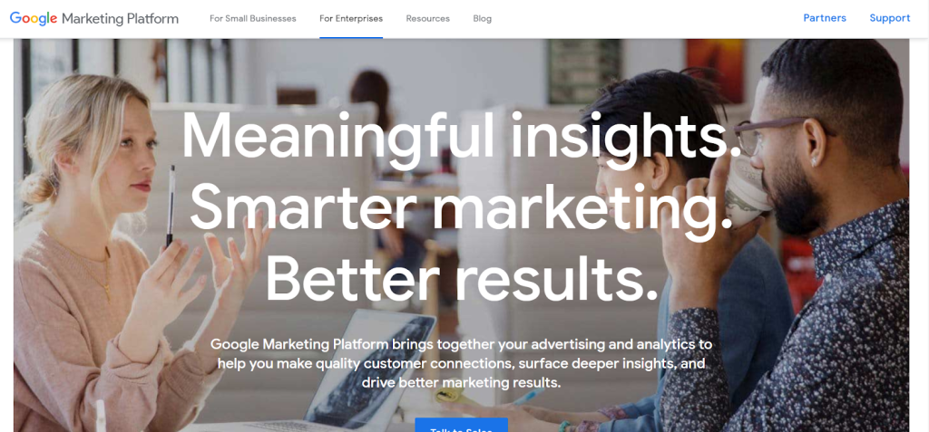
Now, take a look at their competitor, Google Marketing Platform:

Which one’s more effective? The second one, right. Because there’s a significant value proposition in the headline, it tells the reader what you will offer, which is exactly what they care about.
Steps to Fix:
– Use brevity to the full. Don’t go beyond 10 words.
– Showcase the end benefits. Don’t make tall claims saying you’re the leading platform. This takes away the spotlight.
– Use power words, provocative questions, or numbers to build authority
5. Incoherent Images Destroy The Core Messaging of a Landing Page
Humans comprehend visual expressions more clearly than text. A study reveals when presented with images, we tend to retain 65% of knowledge, compared to only 10% when presented with just text. Clearly why a picture is worth a thousand words. It’s a poka-yoke for copywriters. Here’s how you can error-proof your landing page with a picture-perfect show:
Steps to Fix:
– No irregular use of stock images. You’re running a business, not a playschool.
– Only use high-res images. Every reader waits for the picture to tune up. So, don’t keep them waiting forever!
– If possible, show your own products. This forges trust
– Use images with people using your product. This again goes back to not using stock photos.
– Use vectors, eye-gazes to direct visitors to important CTAs. Don’t assume they’re rooting to be your customer. Draw them in!
6. Going For The Slog Too Early
You barely saw the ball, and you’re already two meters down the pitch, ready to whack it into the fourth tier. The result – the balls deviated a fraction, and you got stumped.
You went out too early. And now it’s a long walk back to the pavilion for you.
This is a common mistake – both in cricket and content marketing. Going for the kill without even looking at the target. But time hasn’t run out for you. Here’s what you can do.
Steps to fix:
– Use Case studies, testimonials to prove your worth. Emphasize why they should choose you over a thousand others.
– Nobody will buy on their first visit to your website. They’ll want to know more about you. So, you give them alternative options “Take the Free Trial” or “Read more.”
– It’s always a bit of a moonshot to try to use emails in this day and age. But it WORKS!!! A well-written personalized note could help a doubtful visitor make a buying decision.
7. Your Landing Page Takes Forever To Load
53% of websites are abandoned if pages take more than 3 seconds to load. The ideal website load time is 1-2 seconds. A fraction delay causes the bounce rate to go up to 87%. In short, your website must load as fast as possible. It is harsh but relax! We have a solution.

Step to Fix:
Use Google Page Speed Insights to evaluate the missing parameters. You can then refer to this full-blown blog about loading speed by Moz with all the SEO hacks to rev it up.
Landing pages are more than just fancy webspace. There’s no one-size-fits-all in the case of landing pages. While these 7 mistakes may seem easy to correct but they’re often overlooked. Perhaps due to busy schedules or lack of professional services.
Our professional Landing Page Service in Nashik gets you covered on all bases – from A/B testing to a good value proposition. Go over to our website and request a free quote. We’ll get back to you in no time.


